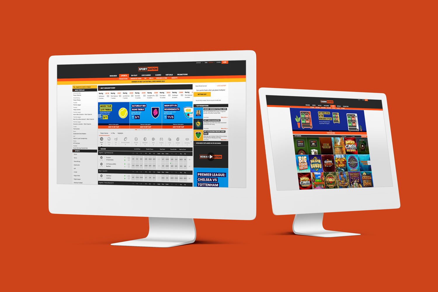
Sportnation.bet is an online bookmaker operating in the UK, known for its unique Rewards programme which allows earning points that can later be exchanged for different prizes. It is also a parent of an online casino branded as Casinonation.
In this project, I was tasked with redesigning their dated logo into something more modern and also creating a new, separate logo for the casino brand.
Design process:
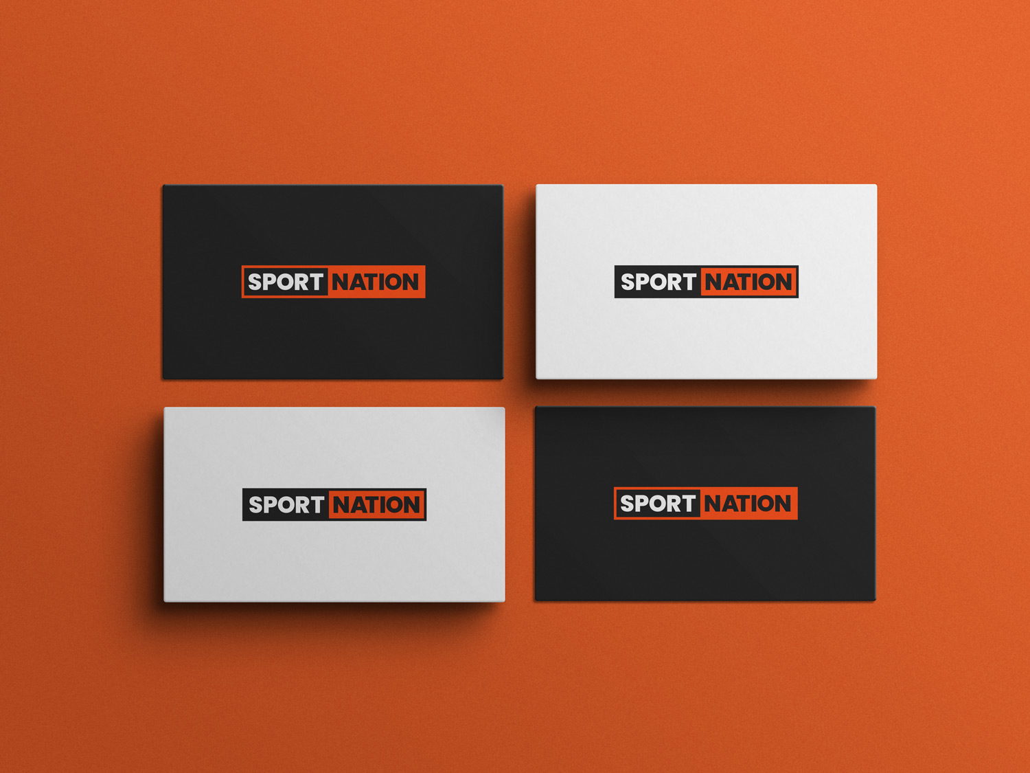
The brand needed to be refreshed, but at the same time, it had to be similar enough to the original. The previous logo had a palette that made it difficult to place it onto light or bright backgrounds. I didn’t want to change the colours as “the brand orange” is easily recognisable to the clients, so I tackled this problem by designing two versions: official and inverted which should be used as needed on light or dark colours.
As an online bookmaker – it is common to use affiliate banners to advertise the business across the Internet. Those have usually very narrow and small formats, so the old, horizontal logo was difficult to place. For this purpose, I also created the square variant which is also in both colouristic versions.
Casinonation logo process:
Together with the marketing team, we decided that the casino’s logo should be similar to the bookmaker’s to ensure that the clients know it’s still part of the same company.
This part of the business is targeted differently hence the name change, but we still needed to make it obvious they are connected to each other.
As mentioned above, the square version was created to fit as needed onto smaller banners.